Showing posts with label color. Show all posts

Thursday, June 2, 2011

Summer Whites

Take heed, ladies! Memorial Day has come and gone, so now's the time to dress yourself in  crisp, cool, classic whites. To celebrate, make it a point this week to add a little bit of white to your usual blues, greys, and blacks. Be it a sexy white dress, a sweet white button down, or some white pumps, let loose and relax as summer time is officially here!


1. Asos | 2. Steve Madden | 3. J. Crew | 4. Top Shop | 5. Heidi Roland | 6. Urban Outfitters | 7. Banana Republic | 8. Free People | 9. Mod Cloth


XOXO
Jen & Saira

Saturday, May 28, 2011

COLOR

Let's get colorful!  In this final post before the conference, I wanted to touch on the subject of color. Too often I have seen artists working in bricolage or collage who only use unpigmented medium or white paint. I hope that this post will inspire you to think about color in your bricolage work--either from added encaustic paint, colored gesso, ink, oilstick, oil paint or oil pastel as well as color from the elements themselves.


Beatriz Milhazes, Brinquelandia, 2008, mixed media collage on paper, 45 1/4" x 56 1/4"
Image from James Cohan Gallery website


Beatriz Milhazes is the contemporary artist I think of as the Queen of Color. The piece above is actually not that typical of her work in that it's pretty geometric, where her usual work contains swirls and arabesques in more rounded shapes. Click the gallery link in the caption above and you'll see 25 other examples of her work.

I picked this one because I wanted to show the use of text as texture and as a means for adding color. I believe that Milhazes uses a lot of food wrappers from candy or gum in her work. In your bricolage work, perhaps you could use pieces of fabric, paint chips, printed advertising or other sources to add color to your work in addition to paint.


Yayoi Kusama, Violet Obsession, 1994, sculpture of stuffed phallic forms
in the shape of a rowboat and oars. Picture taken at MoMA in July 2010.


Detail of the Kusama work


Yayoi Kusama: Talk about saturated color! Here is an example of one hue used to cover a multitude of objects, unifying them and making an intense statement.


Kurt Schwitters, MZ443 (untitled), image from the Menil Collection


Kurt Schwitters: This work by an artist known principally for his collages illustrates how a limited amount of strong color can animate a composition. Note how the use of red brings out the pinkish paper at bottom left (may actually be the back of something red).  Black is also an important color, used in the cut paper and in pencil lines.


Detail from Rebus by Robert Rauschenberg, 1955, mixed media on three panels,
 8x10 feet x 11 1/8", picture taken at MoMA in July 2010.


Robert Rauschenberg's daring use of 3D materials along with paint and canvas was the bridge between Abstract Expressionism and Pop Art. In Rebus he included 117 paint samples lined up between the two drippy reds at the bottom of this image. Here we see color from elements and color from paint, pencil, prints, newspaper, fabric and who knows what else.


Size in inches: 28"x 34 1/4"


Conrad Marca-Relli: I saw an ad for the Knoedler show with a similar piece by Marca-Relli in the current Art News and it caught my eye. I like the way he uses those stripes and adds that unexpected pale blue piece of fabric above. I suppose he means it to represent the sky, but if so, why are those cloud shapes striped too? The only little piece of red (plus white and blue) really draws attention to itself, but the competition with the movement of the stripes is pretty severe. That black L-shape at mid to lower left anchors the block of smaller shapes and implies a shadow.


Conrad Marca-Relli, Cityscape A-M-11-96, 1996, collage and mixed media on canvas, 42" x 45 3/4"


Here's another Marca-Relli with what appears to be a simple organization. The yellowish color at bottom looks like it comes from clasp envelopes. The middle section could be a deconstructed book and the black at the top could be anything but is probably paint. I really like the simplicity of this piece and the color is subtly very powerful. I think you can never go wrong with plenty of black, but that's just me.


Leonardo Drew, Untitled work. Picture taken at Sikkema Jenkins Gallery in February 2010.


Leonardo Drew: One of my favorite artists, Drew uses a lot of black in his work. Here he paints single objects displayed in a grid constructed from old window trim. Note how painting some of the boxes themselves, as well as the objects, breaks up the grid a bit. Also some of the objects are more dimensional than others and some boxes are painted whiter or less brown than others. It gives the work a more organic look and softens the geometry.


Lee Bontecou, Untitled 1961, welded steel, canvas, wire and rope,
72 5/8" x 66" x 25 7/16", image from the website of the Whitney Museum

Lee Bontecou, another of my faves, also used plenty of black in her early work. The color of the recycled canvas pieces in this one came from use (dirt) in their prior industrial life and from soot that she applied with her welding torch. The combination of the two sources gave the work a distinctive greyed-out taupe-ish color that combines beautifully with black as the color really all comes from the black scale.


Work by Brian Dickerson.  Unfortunately, something is wrong with his website
that won't allow me to look up the info on this individual work.,
but as I recall it, this is a good-sized piece, 40"-ish in size


Brian Dickerson: Here's another work that uses a color with plenty of black in it. This is a taupe with a warm temperature (toward red) as compared with Bontecou's cool (toward green). I really like Dickerson's work, which is constructed with hidden enclosures and buried components. The freshness of that little piece of  green in the midst of all that black and brown really brings the piece alive when highlighted by the white next to it. There is no question about the compositional focus being on the inset color, but what's that strange line of something inset to its left? Ah, mystery! (Here's another link to see Dickerson's work at Kouros Gallery in NYC this summer.) By the way, the list of materials in Dickerson's work says "oil, wax, mixed media on wood." I'm guessing the wax is cold wax mixed with oil paint, but I could be wrong.


Hannelore Baron, Untitled box construction, 1985, 14" x 8" x 2 1/2"


Hannelore Baron:  I am not sure what the objects in the box are, but the color that she has used on them is dark, rich and subtle in combination with that beautiful brown of the box. Whatever those vertical pieces are, they are being restrained by the rope and string and the viewer is being kept out of their intimate interior space. I am making the point here that dark color brings a richness and depth not found in bright, saturated color. My eye seems to go into the dark while light color stays on the surface.


Henry Klimowicz, Circles #3, 7 x 7 feet, cardboard and hot glue


Henry Klimowicz is a master of cardboard. He makes huge and spectacular work using just this one material and hot glue. The color is all from the cardboard itself, but the shape of the elements influences the value because the light strikes it differently depending on size and shape. This is something else to consider when making a bricolage composition from one type of element, and a factor that's also apparent in the work of El Anatsui, for example. How much can you vary the color by varying size and shape of one type of element? More on Klimowicz's website.


Spectacular cardboard works from a Klimowicz exhibition


Tara Donovan, Untitled, 2003, styrofoam cups and hot glue, 6x20x19 feet


Tara Donovan: The master of works made from one element, Donovan adds no color to her works, but the way light hits the surfaces of the elements provides plenty of variety. Probably color is not the first thought you would have when looking at Donovan's work, but here is one more example of a repeating element using light as its palette. (Take a look at more of Donovan's work at the Boston ICA.)


Kathryn Frund, Rapture, Rupture #6, 16"x16", image from website of  Chase Young Gallery, Boston


Kathryn Frund: Here is more color from elements (natural wood) plus a thin layer of paint over the natural color of the crumpled and wrinkly metal. Slightly visible at left and bottom is more color from the panel underneath. This is subtle, mostly invisible color that still works its magic. (Click the link for the gallery to see Frund's usual much more colorful work.)


Catherine Nash, Reliquary to the Dawn, 2011, 14"x13"x5", mixed media assemblage with vintage drawer,
encaustic, nautilus shell, antique market finds, raku-fired ceramics, lashed pine needles
from the Gila Wilderness in New Mexico gathered at dawn


Catherine Nash: This lovely piece gets its color from aged wood, rust, the soft tans of the pine needles with the darker bands of twine, and the luminescence of the shell. The highlight is the small encaustic painting with the pale turquoise and pinkish white of dawn's rosy glow. The 3D element of the shell plays an important role by providing the link in color and shape between the painting and the found elements. Notice that the found elements are not embedded in encaustic but left in their natural state and attached by other means to the drawer. (More of Catherine's work here and here. Studying Catherine's work will provide plenty of examples of how to combine encaustic with found elements.)


Sharon Booma, Nothing But a Rumor, 2011, 60"x60"x3", oil and mixed media on pan


Sharon Booma, Unobstructed Effort, 2011, 48"x48"x3", oil and mixed media on panel


Sharon Booma, Opportune Moment, 42"x42"x3", oil and mixed media on panel


Sharon Booma: Finally, I'm showing you three by Sharon Booma to illustrate the use of strong allover color with elements both painted over and exposed in the color field. Booma is a master of this type of painting. Notice how she leaves plenty of empty space (color field) for the eye to rest in. Having elements submerged in the field or partially exposed by scraping adds a sense of discovery for the viewer. Imagine how blah these works would be if they were painted only with unpigmented medium. Also notice that while there is a predominant color, there are also many other colors included in each work. These colors could be added with mediums other than encaustic or come from the elements themselves. (Note that if you are coming or going through Boston to or from the conference, Booma shows at Arden Gallery on Newbury Street, where you can also see work by Joanne Mattera, Kim Bernard and me).


I hope that this post will give you more ideas for your work and add some possibilities for bricolage that you may not have considered previously. I'm looking forward to meeting everyone at the conference and working with you in the post-con workshop(s). The mystery boxes are being assembled and will be waiting for you to reveal their contents.

Thursday, April 7, 2011

Lovely in Lilac

Despite the fickle weather, we're desperately trying to incorporate spring colors into our wardrobe. One of our favorite shades for the spring is lilac (or violet... we don't really know the difference). It's fresh and sweet, and can really brighten up your wardrobe. Ignore the weather, and add some spring to your step!


We call this dress the "Sexy Easter" dress. This two-tone color block dress from American Apparel is an ideal look for the spring. May we suggest a cropped black blazer to give this a retro 80s feel?


Don't have much uses for tight, sexy pastel numbers? Then try this grey / lavender skirt from The Limited. It's a professional but feminine, and is a great way to freshen up your wardrobe.


With all this rain we've been getting, you need to protect your tootsies! Grab a pair of these short rainboots by Ilse Jacobsen and you'll be singing in the rain! Oh, and did we mention they have fleece lining?


 This sleeveless tea dress from Top Shop is perfect for work or play. Add a fitted blazer and pearls and you're set for work, or throw on a pair of gold hoops and strappy sandals and you're ready for a hot night on the town.


Tired of the regular old smokey eye? Add a pop of color with the purple smokey eye set from Sephora.  It will be sultry and romantic, just what you need for perfect "come hither" eyes.


Every girl needs a versatile dress that can be work at the park, out to dinner, for a garden party, whatever! This tiered ruffle dress from Old Navy definitely fits the bill, and will guarantee you a few compliments.


These lilac pumps are a must have this spring. They will look wonderful with a light gray suit, white dress, or black capris. We would steer away from pairing the pumps with a matching lilac dress and / or blouse. The most matchy-matchy we would do is matching jewelry, and even that's pushing it!


XOXO,


Jen & Saira

Wednesday, October 6, 2010

Color Day Themes: Ornate Oriental

Jen is currently traveling in Asia, so we thought this "Oriental" inspired color-day would be appropriate.  The underlying color to this theme is red, which can be as subtle or as bold as you want. The key to this theme is the details: go for the take-out boxes, over-sized lanterns, paper cranes, chopsticks, and fortune cookies.  We realize we're blending cultures, but you can pick and choose what look you want to go with. Just remember to be bold, and when in doubt, go for take-out!


Tuesday, August 3, 2010

Color Day: Rose/Blush Pink & Mauve

So, we're gearing up for Fall here at PDR. And, while we certainly have some more Summer fun in store for you, we can't help but be enticed by Fall color schemes.  Typically blush/rose pink is considered a spring color, but when placed next to mauve it has a very warm and cozy feel to it, perfect for those cool Fall nights.   Blush and mauve is one of the hot color combos for this year (according to www.theknot.com) so, here is an inspiration board to encourage you to try it out and give your own little twist to this trendy color combo this season.


Rose/Blush Pink & Mauve Wedding Color Inspiration Board


XOXO,
Jen & Saira         


Tuesday, July 20, 2010

Color Day Themes: Sunflowers!

We're doing color Wednesday a little different today.  When thinking of what colors to do this week, we decided it might be fun to try a motif or theme instead.  Many people to choose to theme their decor according to different seasons, areas around the globe, patterns, etc.  Today's Inspiration Board is based on a summer staple, the Sunflower!  Sunflowers always seem to have the power to liven things up and energize a space. There is a strange bit of happiness you feel when looking out at a sunflower field and you can't help but smile when you see their bright and cheery faces awaken to the morning sun.


Sunflower Wedding Inspiration Board


It's a sunshine day!      


XOXO,
Jen & Saira

Tuesday, June 22, 2010

Color Day: Chartreuse and Raspberry

Todays color day celebrates summer with bright and fun chartreuse and romantic raspberry red.  "What the heck is chartreuse", you ask?  Well, it's a fancy little name for "yellow-green".  Not quite lime but not quite yellow, this in between shade is unique and not usually found in most weddings or general decor/wardrobes.  Most people feel this color is too bold but we'd have to disagree! This hue can easily be toned down with neutrals like taupe or white.  We suggest using this retro color in small doses and accenting it with the fresh and feminine shade of raspberry red for a cutting edge, modern, color combo for summer.  


Raspberry and Chartreuse Color Inspiration Board


XOXO,
Jen & Saira

Tuesday, June 15, 2010

Color Day: Sea Green, White, and Khaki

Misty sea green, soft white, and warm khaki come together in this surfer's delight color combo, perfect for your beach wedding, home, or summer time event.  This medley is inspired by sea glass scattered across the sandy beaches and rolling waves, with their white crests, crashing on the shore.   It makes us want to kick our shoes off, dig our feet in the sand, and let our worries drift away with the tide.  A fusion such as this one serves to evoke the calm and carefree feelings that we're sure will keep you cool as a cucumber, even in the most stressful of times.


Sea Green Wedding Color Inspiration Board


Images from: Ashley's Bride GuideShopBop, Juicy Couture,  Debenhams,  BravoBride,   Hampton Jewels,  Minus One,  Beach Grass Cottage,  Giardino,  GreenCycledDesigns, Utah Bride Blog,  BrooklynRehab, David's Bridal


Hang Loose!


XOXO,

Jen & Saira


Tuesday, June 8, 2010

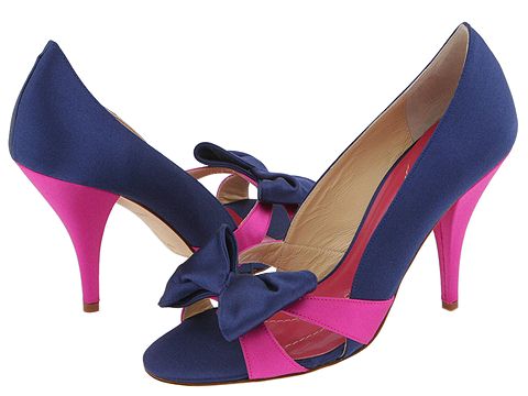
Color Day: Magenta/Fuchsia and Navy

Nautical, masculine navy meets frilly, feminine magenta in this hot color combination for summer. Inspired by nature's fruits, raspberries and blueberries, this palette is sweet and delightful.  We love the way these colors blend and how the elegance of the navy is perfectly offset by the playful magenta for an absolutely harmonious balance.  Be sure to accent this mixed berry combo with a cool metallic silver, and if you are going for a combination like this one, basic white should act as your blank canvas to make these two colors really pop!


XOXO,
Jen & Saira 

Tuesday, June 1, 2010

Color Day: Lime and Tangerine

Welcome back, dolls!  We know you missed us yesterday, but here we are with our usual  Color Day post.


Oh, the hues of citrus fruits that give us such an energizing lift!  We can't help but be drawn to exciting, refreshing shades like those of tangerine and lime and so here is an inspiration board that sets a lively and fun tone for any event.  We also think these hues would be great to use to decorate your outdoor space for all those fabulous barbeques you'll be having.


Images from: Porter House Designs,Flickr, Wedding Bee, David's Bridal, Carousel Designs, The Lace Store, Jennifer Lindberg Weddings via TheKnot, Nordstrom, Tina Rowden Photography via TheKnot


Any color combos you guys are interested in seeing? If so, feel free to comment or send us an email with your special request and we'll whip one right up for you. 


XOXO,
Jen & Saira   

Tuesday, May 25, 2010

Color Day: Nautical Navy and Yellow

Ahoy, sailor! While we already gave you a little taste of a nautical theme with our wardrobe post we haven't yet featured it as a color inspiration.  Today we feature two colors that are very prominent in the sailing world!  Often when you think nautical you think blue and white, but what you'll also notice is a lot of times these colors will be accented with a rich gold. Blue and yellow (gold/mustard/whatever you want to call it) are the perfect colors for your nautical themed project as one color anchors your palette as a neutral, while the other is your fun color that you can add in small doses to liven things up.


     XOXO
Jen & Saira


Tuesday, May 18, 2010

Color Day: Fuchsia and Grey

As summer draws nearer, we can't help but gear ourselves towards bright and fun colors like today's inspiration, fuchsia (aka magenta)! This is a reddish purple hue, named after the flower of the same color, looks funky and energizing when paired with orange, yellow, or green, yet chic, modern, and even a little vintage when combined with bright white or cool grey. We prefer this shade as an accent and not as a main color because all fuchsia all the time can be a bit overwhelming. Instead, keep the men in your life sane and tone down the pink/purple by basing your color palette in a classic neutral, like a heather gray, and use the fuchsia to draw attention to fun and funky details like ties, flowers, shoes, etc. 


XOXO
Jen & Saira

Tuesday, May 11, 2010

Color Day: Turquoise & Red

Different colors evoke different emotions and selecting the appropriate colors for your space or event are often difficult. There are cool tones, warm tones, & neutrals and you usually pair colors together according to their color families. It is typical for people to select like colors and play it safe... but the rare few that are daring enough to go for complimentary colors are the ones that are sure to make the biggest impact! We love those that are bold enough to go for color combos that are opposites on the color wheel, like these shades of blue and red! The pairing of cool turquoise and warm, bright red is a bold choice for the ultra modern home, wedding, or wardrobe.


XOXO
Jen & Saira